Hiway Brand Identity
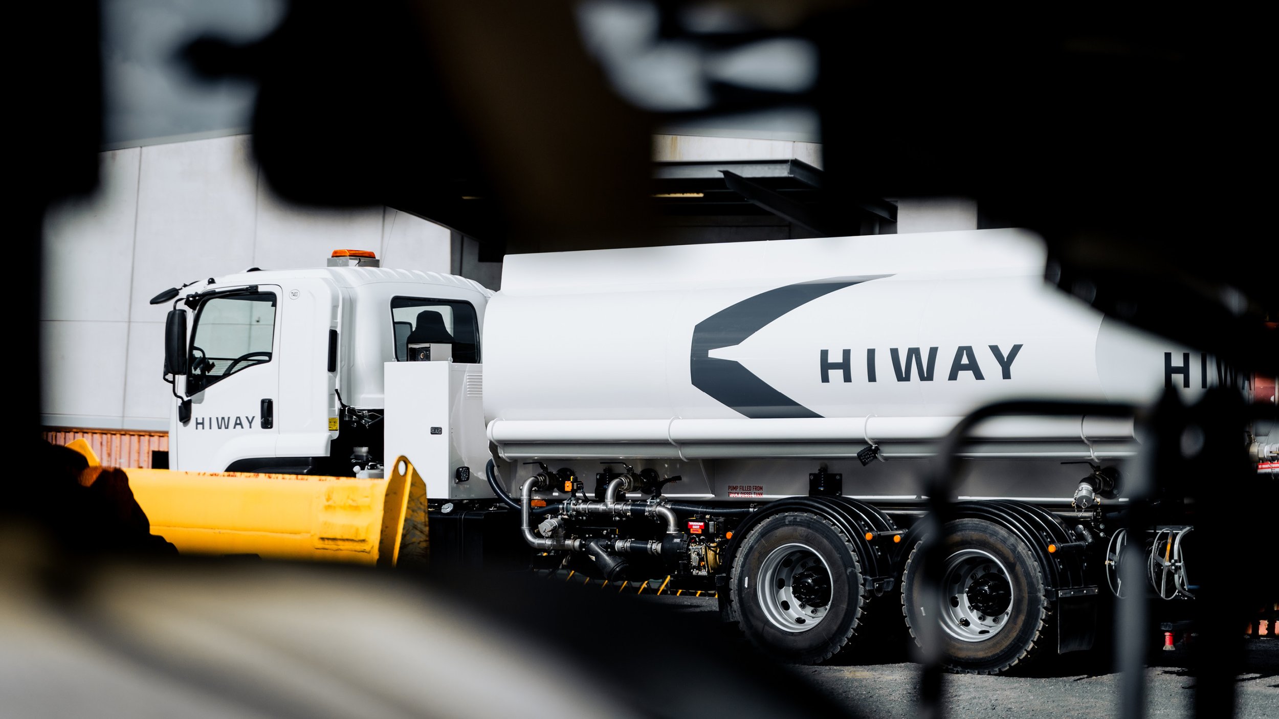
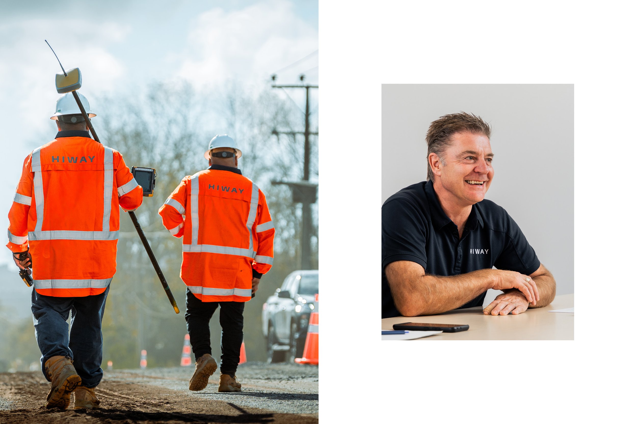
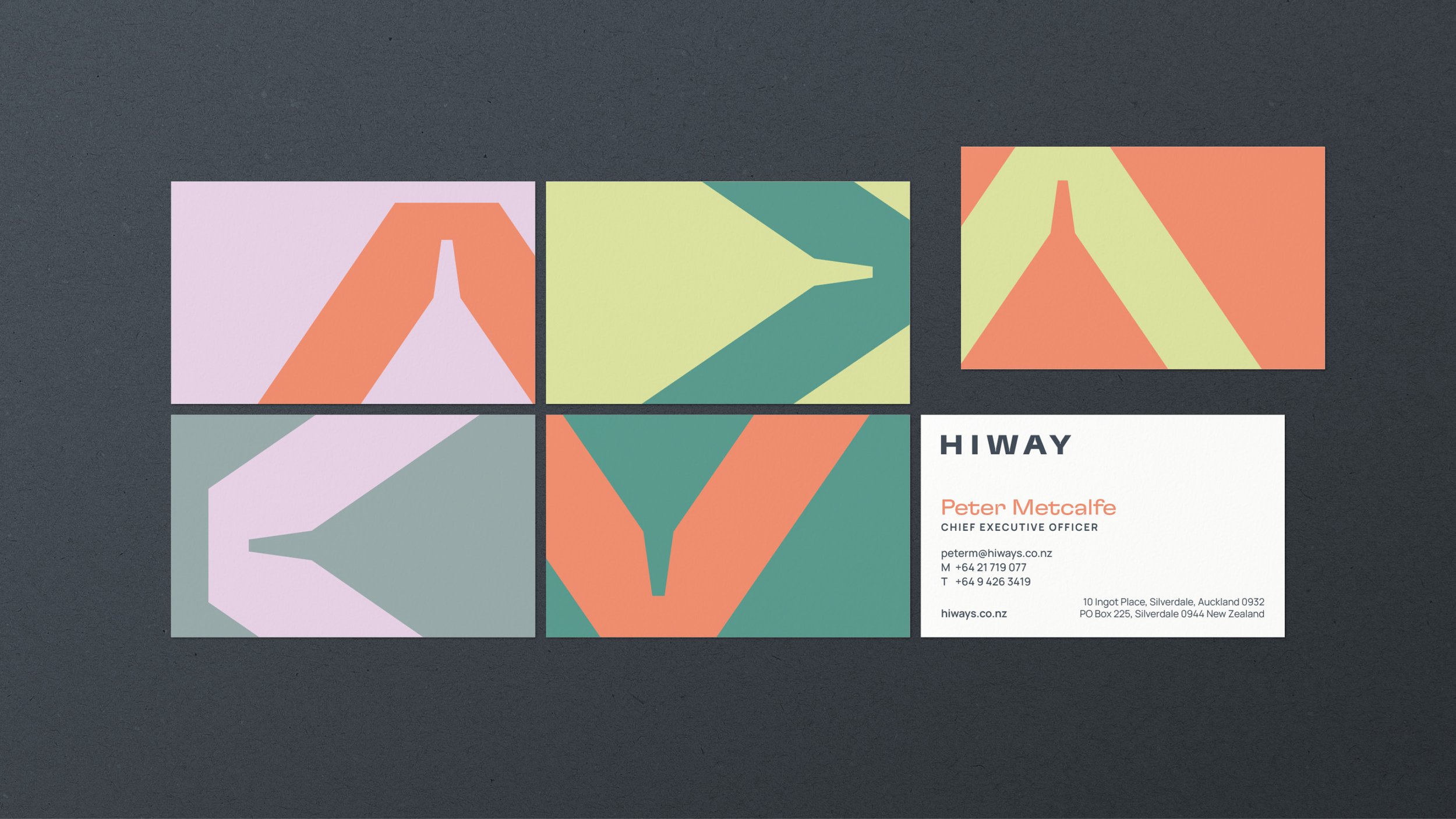
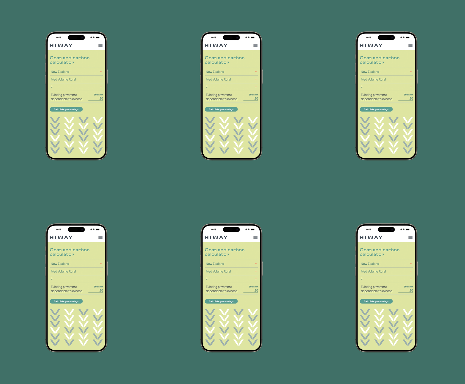
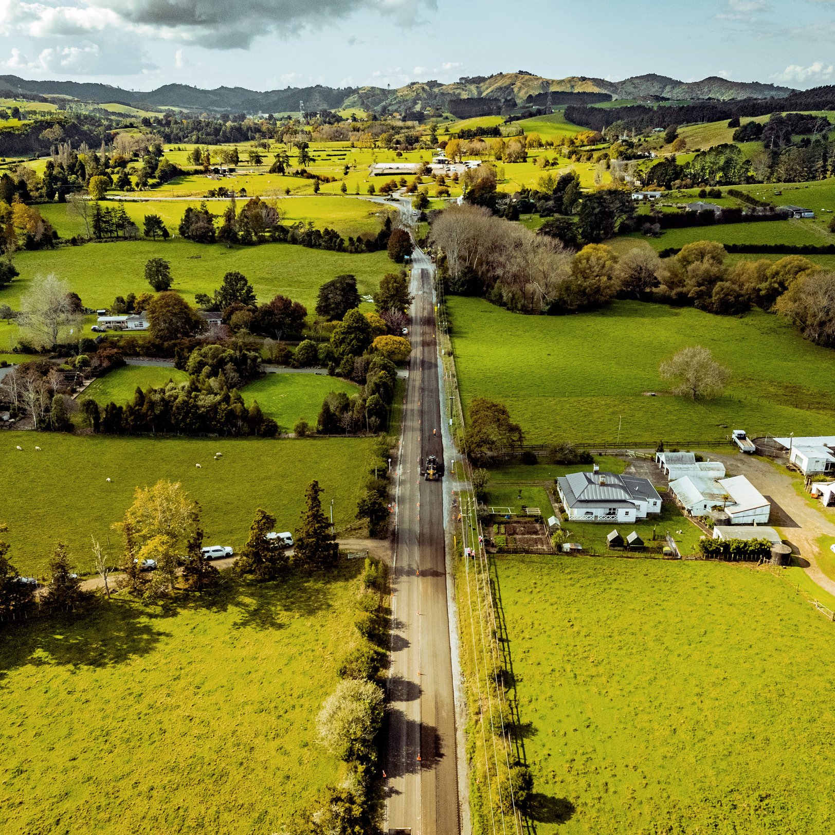
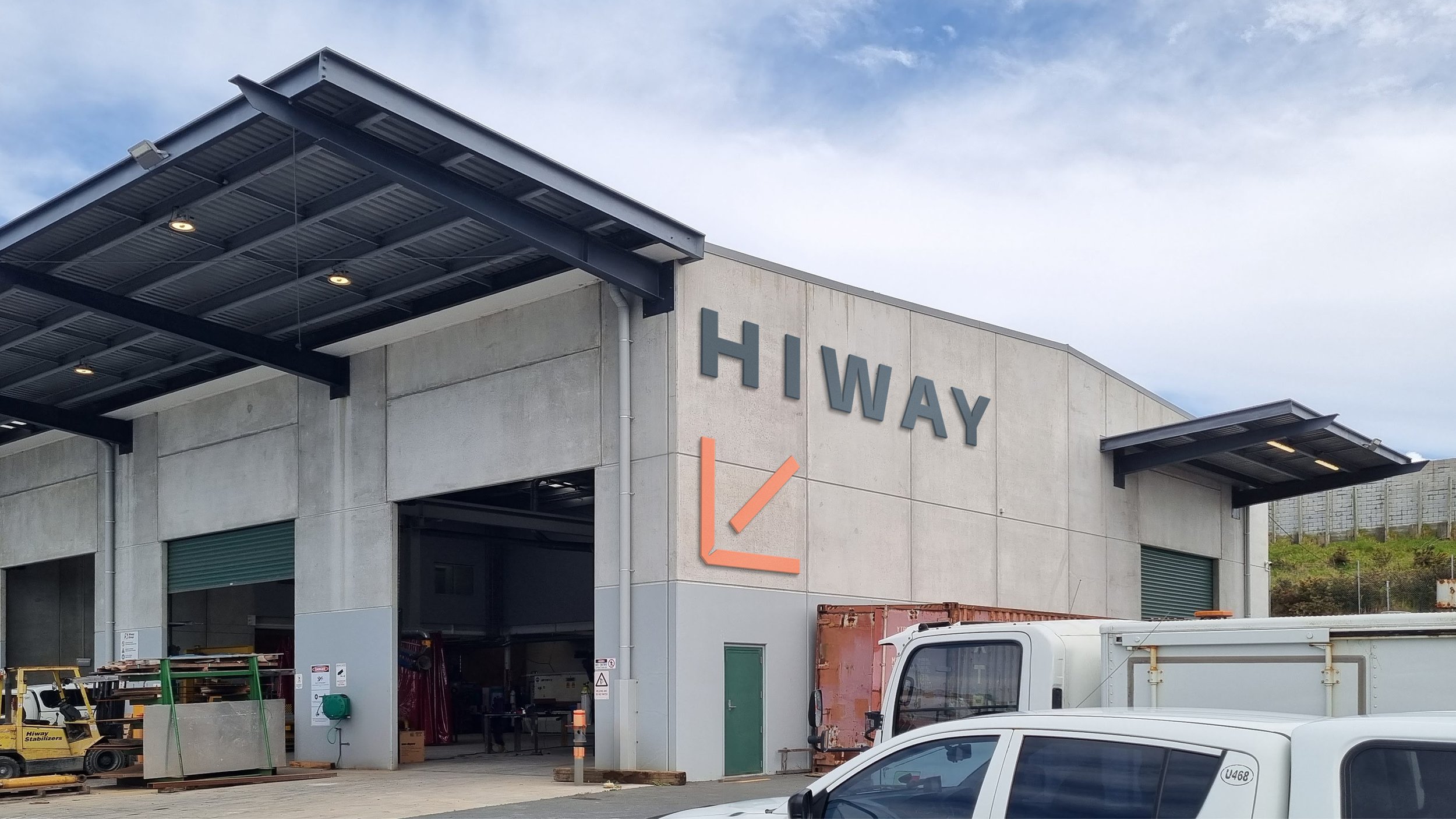
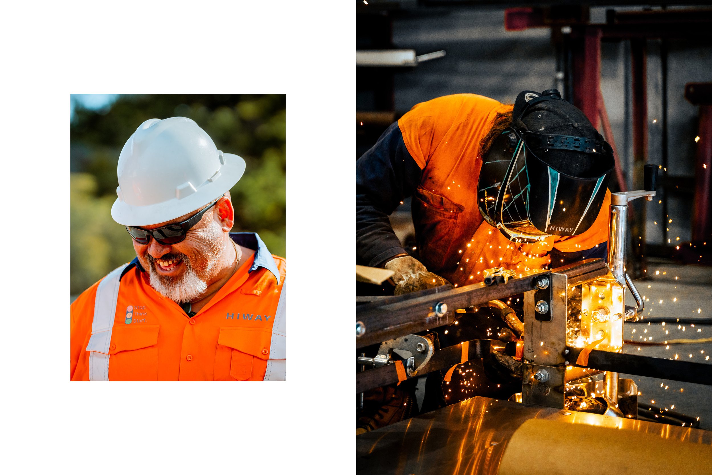
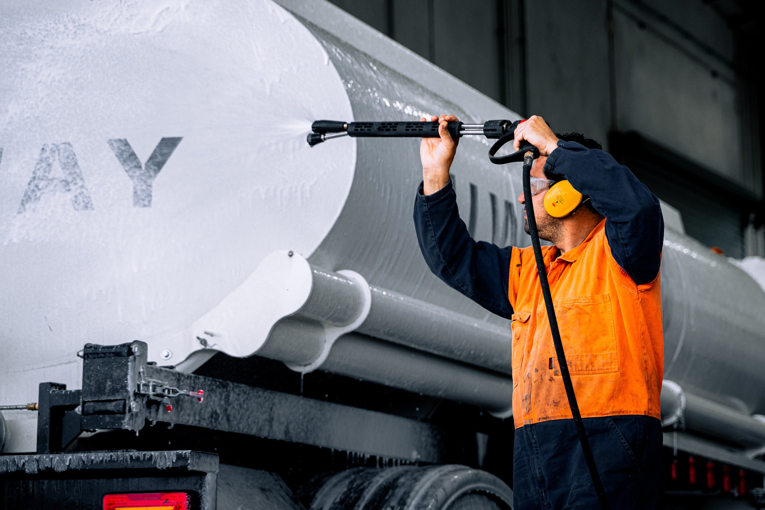
Hiway, a leader in Australasian roading infrastructure, found its brand fragmented after decades of growth and acquisitions. Our brief was to reposition the company as a cohesive, purpose-driven business, focused on reducing the continent’s carbon footprint while maintaining infrastructure. We show the optimism of a more sustainable way, standing out in the sector with fresh colour and human-centric typography. The expansive logo gives a sense of stability, while refined details indicate technical precision. New photography seeks out defined shapes in materials and machinery, alongside the blend of intelligence and warmth that characterises the company’s culture. The new brand signifies a more balanced and carbon-conscious future for our transport networks – sustaining our environment and, in turn, sustaining our communities.
My role – Design Director: Concept, graphic design, UX/UI design, art direction of photography/videography, storyboarding, animation direction, music curation
Creative Director: Chris Gough Palmer
Team: Sarah Chen (animation), Jesse Marsters (photography/videography), Nero (web development)
Agency: Saturday
